Customize Component Mapping
UI Kitten components are styled with Eva Design System configuration files and themes. When we talk about configuration files we mean a mapping provided by Eva Design System. This configuration file is later processed by Eva Design System Processor to provide a final style applied by a component.
In terms of UI Kitten the mapping configuration file is a JSON or a JavaScript object which describes the rules and behavior for each component provided by UI Kitten.
Working with mappings is a quite difficult process, but it gives you a lot of flexibility to style components. Let's take a look at some simple examples of customizing UI Kitten components.
Determine a change
You're able to do the following changes in mapping:
- Change a single parameter
- Change a semantic property
While changing a single parameter is a simple process, changing semantic properties is a bit harder. However, read a corresponding guide below to see how it could be done.
Create a mapping
Let's create a file to define a mapping. In your project root, create a mapping.json:
{
  "components": {
    "Button": {
      "meta": {},
      "appearances": {}
    }
  }
}
The code above contains a bare minimum of code to start customizing a Button component.
Change a single parameter
Let's assume we want to change the default backgroundColor of a Button. Before we do this, let's take a look at how it is configured by Eva Design System. Open a configuration file. It should be located in ./PROJECT_ROOT/node_modules/@ui-kitten/eva/mapping.json.
In order to change the default parameter, you need to find out where it is declared. To do that, we can quickly look through a meta-information about a component.
{
  "components": {
    "Button": {
      "meta": {
        "appearances": {
          "filled": {
            "default": true
          }
        },
        "variantGroups": {
          "status": {
            "primary": {
              "default": true
            }
          }
        }
      }
    }
  }
}
We determined that default appearance is filled and default variant for a status group is primary. This means, that a backgroundColor property should be declared inside some of them. Let's now find a default appearance configuration.
{
  "components": {
    "Button": {
      "meta": {},
      "appearances": {
        "filled": {
          "mapping": {},
          "variantGroups": {
            "status": {
              "primary": {
                "backgroundColor": "color-primary-default"
              }
            }
          }
        }
      }
    }
  }
}
Now let's go back to our mapping.json and modify backgroundColor to be pink:
{
  "components": {
    "Button": {
      "meta": {},
      "appearances": {
        "filled": {
          "mapping": {},
          "variantGroups": {
            "status": {
              "primary": {
                "backgroundColor": "pink"
              }
            }
          }
        }
      }
    }
  }
}
Merge mappings
The only thing we have to do is to pass our mapping to an ApplicationProvider component.
import React from 'react';
import * as eva from '@ui-kitten/eva';
import { ApplicationProvider } from '@ui-kitten/components';
import { default as mapping } from './path-to/mapping.json'; // <-- import mapping

export default () => (
  <ApplicationProvider
    {...eva}
    customMapping={mapping}
    theme={eva.light}>
  </ApplicationProvider>
);
Custom Mapping is applied automatically in case of using @ui-kitten/metro-config package, meaning there is no need to modify ApplicationProvider. To check this, see if it used in metro.config.js. Relative guide.
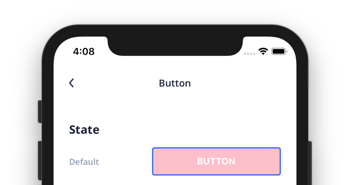
Here we are. Now the default backgroundColor of a Button should be pink. Here is a result:
Change a semantic parameter
Making changes with semantic parameters means changing a set of parameters declared inside it. To do that, simply follow the steps of changing a single parameter explained above.
You are also able to make one of the semantic parameters to be used by default. Let's take an example with a Button appearance.
{
  "components": {
    "Button": {
      "meta": {
        "appearances": {
          "outline": {
            "default": true
          }
        }
      }
    }
  }
}
That's it. Now you're able to use UI Kitten Button without passing appearance property.
Recipes
The questions that come up most often, each with a mapping that works as is. A custom mapping only
needs the keys you change: meta is required only when you add a new appearance, variant or state,
and everything else is deep-merged over the Eva or Material mapping.
Round the corners of every Input
borderRadius lives in the size variant group of Input, so override it per size:
{
  "components": {
    "Input": {
      "appearances": {
        "default": {
          "variantGroups": {
            "size": {
              "small": { "borderRadius": 20 },
              "medium": { "borderRadius": 20 },
              "large": { "borderRadius": 20 }
            }
          }
        }
      }
    }
  }
}
The same shape works for Button, Select and Datepicker, which also keep borderRadius under size.
Change the default text size
Text renders the p1 category unless told otherwise, and a category maps fontSize, fontWeight
and fontFamily. Override the category you use:
{
  "components": {
    "Text": {
      "appearances": {
        "default": {
          "variantGroups": {
            "category": {
              "p1": { "fontSize": 17 },
              "p2": { "fontSize": 15 }
            }
          }
        }
      }
    }
  }
}
Other components that show text (Button, Input, ListItem, TopNavigation, ...) size it through
their own textFontSize / titleFontSize parameters, which reference the text-*-font-size strict
tokens of the mapping (Input uses text-subtitle-1-font-size, a medium Button
text-subtitle-2-font-size; look the parameter up in mapping.json). Those tokens can be overridden
the same way, under the top-level strict key, which changes every component that references them:
{
  "strict": {
    "text-paragraph-1-font-size": 17,
    "text-subtitle-1-font-size": 17
  }
}
Values computed at runtime (font scale, screen size)
customMapping is a plain object, so it can be built in JavaScript rather than loaded from a JSON
file. Compute it once, memoize it, and pass it to ApplicationProvider:
import React from 'react';
import { PixelRatio } from 'react-native';
import * as eva from '@ui-kitten/eva';
import { ApplicationProvider } from '@ui-kitten/components';

const useScaledMapping = () => React.useMemo(() => {
  const scale = Math.min(PixelRatio.getFontScale(), 1.3);
  return {
    strict: {
      'text-paragraph-1-font-size': Math.round(15 * scale),
      'text-subtitle-1-font-size': Math.round(15 * scale),
    },
  };
}, []);

export default () => {
  const customMapping = useScaledMapping();
  return (
    <ApplicationProvider {...eva} theme={eva.light} customMapping={customMapping}>
      {/* ... */}
    </ApplicationProvider>
  );
};
Two things to keep in mind:
- Memoize the object. A new
customMappingidentity makes the provider recompile the mapping and every styled component recompute its style, which is what you want when the value changes and pure waste when it is re-created on every render. @ui-kitten/metro-configcompiles the mapping at build time and hands the result toApplicationProviderasstyles(the{...eva}spread carries it). Whenstylesis present the provider skips runtime compilation, andcustomMappingis ignored. For a mapping that depends on runtime values, passmapping={eva.mapping}instead of spreadingeva, so the provider compiles at runtime and merges your object; the cost is one lazy compilation per component on first use.