Create a Custom Component Mapping
Creating a mapping for a custom component is a very similar process to Mapping Customization. Only in this case, we suggest the following simple but very important rules so that we can minimize the number of necessary changes and avoid repeated code.
Before we start, let's pretend we want to create a CircleButton component.
Prepare the boilerplate
In this step, we'll create a component and its initial mapping.
Create a component:
import React from 'react';
import { TouchableOpacity } from 'react-native';
import { styled } from '@ui-kitten/components';

const CircleButton = styled('CircleButton')((props) => {
  const { eva, style, ...restProps } = props;
  return (
    <TouchableOpacity style={[eva.style, style]} {...restProps} />
  );
});

export { CircleButton };
Create a mapping:
{
  "components": {
    "CircleButton": {
      "meta": {
        "parameters": {},
        "variantGroups": {},
        "states": {},
        "appearances": {
          "filled": {
            "default": true
          }
        }
      },
      "appearances": {
        "filled": {
          "mapping": {}
        }
      }
    }
  }
}
And pass it to an ApplicationProvider component:
import React from 'react';
import * as eva from '@ui-kitten/eva';
import { ApplicationProvider, Layout } from '@ui-kitten/components';
import { default as mapping } from './path-to/mapping.json'; // <-- Import mapping
import { CircleButton } from './path-to/CircleButton'; // <-- Import component

export default () => (
  <ApplicationProvider
    {...eva}
    customMapping={mapping}
    theme={eva.light}>
    <Layout style={{ padding: 64, alignItems: 'center' }}>
      <CircleButton />
    </Layout>
  </ApplicationProvider>
);
Custom Mapping is applied automatically in case of using @ui-kitten/metro-config package, meaning there is no need to modify ApplicationProvider. To check this, see if it used in metro.config.js. Relative guide.
Start with an idea
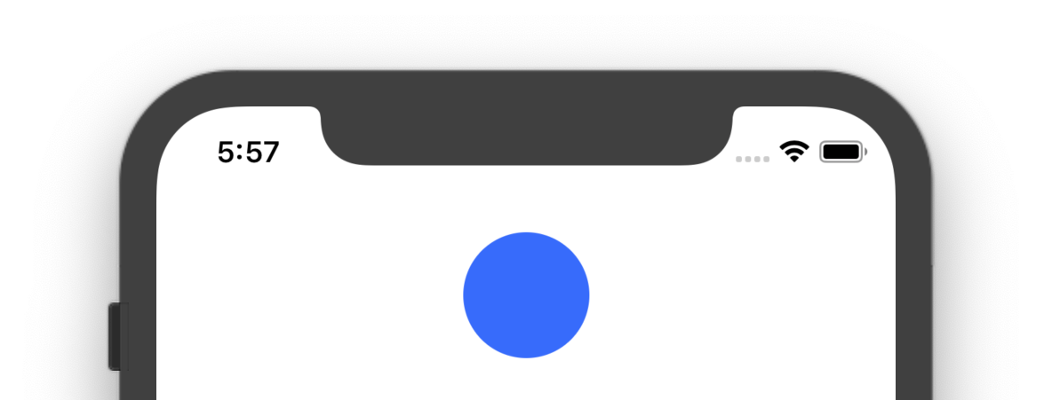
The main idea of CircleButton component is that it is going to be a circle. This means we need to provide some dimension styles and a borderRadius to make it round. Go back to mapping.json and paste the following:
{
  "components": {
    "CircleButton": {
      "meta": {
        "parameters": {
          "width": { "type": "number" },
          "height": { "type": "number" },
          "borderRadius": { "type": "number" },
          "backgroundColor": { "type": "number" }
        },
        "variantGroups": {},
        "states": {},
        "appearances": {
          "filled": { "default": true }
        }
      },
      "appearances": {
        "filled": {
          "mapping": {
            "width": 64,
            "height": 64,
            "borderRadius": 32,
            "backgroundColor": "color-primary-default"
          }
        }
      }
    }
  }
}
This is an initial look:
Expand with variants
The example above demonstrates how you can create a really simple configuration. Let's now do some magic.
{
  "components": {
    "CircleButton": {
      "meta": {
        "variantGroups": {
          "shape": {
            "rounded": { "default": false }
          }
        }
      },
      "appearances": {
        "filled": {
          "mapping": {},
          "variantGroups": {
            "shape": {
              "rounded": {
                "borderRadius": 16
              }
            }
          }
        }
      }
    }
  }
}
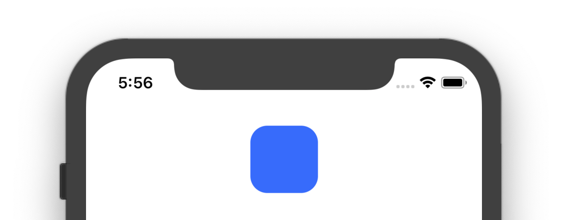
What we did is that we added a rounded variant which will make our CircleButton not such circle. Let's now pass it to a component:
import React from 'react';
import * as eva from '@ui-kitten/eva';
import { ApplicationProvider, Layout } from '@ui-kitten/components';
import { default as mapping } from './path-to/mapping.json';
import { CircleButton } from './path-to/CircleButton';

export default () => (
  <ApplicationProvider
    {...eva}
    customMapping={mapping}
    theme={eva.light}>
    <Layout style={{padding: 64, alignItems: 'center'}}>
      <CircleButton shape='rounded'/>
    </Layout>
  </ApplicationProvider>
);
And this is how it looks:
Add states
The other great example of the flexibility of using mappings is that you can provide styles to your component for a particular state. Let's say we've pressed this Button and we want to see the default feedback of TouchableOpacity, but make our Button a shade darker.
{
  "components": {
    "CircleButton": {
      "meta": {
        "states": {
          "active": { "default": false }
        }
      },
      "appearances": {
        "filled": {
          "mapping": {
            "state": {
              "active": {
                "backgroundColor": "color-primary-active"
              }
            }
          }
        }
      }
    }
  }
}
And dispatch this state from a component.
import React from 'react';
import { TouchableOpacity } from 'react-native';
import { styled, Interaction } from '@ui-kitten/components';

const CircleButton = styled('CircleButton')((props) => {
  const { eva, style, ...restProps } = props;

  const onPressIn = () => {
    eva.dispatch([Interaction.ACTIVE]);
  };

  const onPressOut = () => {
    eva.dispatch([]);
  };

  return (
    <TouchableOpacity
      {...restProps}
      activeOpacity={1.0}
      style={[eva.style, style]}
      onPressIn={onPressIn}
      onPressOut={onPressOut}
    />
  );
});

export { CircleButton };
What we have done here is we used dispatch prop provided by a styled HOC we previously wrapped our component. And now, when we press a Button, it will be re-rendered with a new color. But when we release it, it will be filled with a default color.
That's it. Here is the result:

Conclusion
Using this way of styling components, you can also declare more semantic parameters to get more flexibility. Try adding one more variant or appearance following the steps described above to feel the real power of UI Kitten theme system.