Changing Color Scheme
We tried to make the process of color scheme customization as easy as possible.
By default ng2-admin has three built-in color profiles: ng2 (default blue scheme), mint and blur. This article will help you to create your own color profile. Let’s say you want to make ng2-admin dark theme.
First we advise you to take some existing colorscheme file as a starting point.
For light themes we suggest taking src/app/theme/sass/conf/colorScheme/_mint.scss and for
dark src/app/theme/sass/conf/colorScheme/_blue.scss.
As we want a dark theme, we’re taking blue.
1) Copy src/app/theme/sass/conf/colorScheme/_blue.scss to src/app/theme/sass/conf/colorScheme/_dark.scss:
2) Include your colorscheme file in src/app/theme/sass/conf/conf.scss.
To do this, replace
@import 'colorSchemes/ng2';
with
@import 'colorSchemes/dark';
3) Change the color scheme enabled:
Open src/app/theme/theme.config.ts.
Uncomment the following line
//this._baConfig.changeTheme({name: 'my-theme'});
and put your theme name, in our case it is dark
this._baConfig.changeTheme({name: 'dark'});
Beside notifying the system which scheme is currently enabled, this also puts a css class to a main element of the page. Thus you can freely create theme-specific css selectors in your code without breakking other themes’ styles.
For example like this:
. dark .card-body {
  background-color: white;
}
4) Change the colors:
Now you can start changing the colors.
For example, after playing a bit with different colors, we changed the 2 first main variables in _dark.scss file:
$body-bg: #636363;
$bootstrap-panel-bg: rgba(#000000, 0.2);
After this is done, you need to setup javascript to use the same colors. These colors
are used for javascript charts and other components (maps, etc);
Let’s completely change the JS colors to a new set.
To do this, add the following code to the configuration block inside src/app/theme/theme.config.ts:
  let colorScheme = {
    primary: '#209e91',
    info: '#2dacd1',
    success: '#90b900',
    warning: '#dfb81c',
    danger: '#e85656',
  };
  this._baConfig.changeColors({
    default: '#4e4e55',
    defaultText: '#e2e2e2',
    border: '#dddddd',
    borderDark: '#aaaaaa',

    primary: colorScheme.primary,
    info: colorScheme.info,
    success: colorScheme.success,
    warning: colorScheme.warning,
    danger: colorScheme.danger,

    primaryLight: colorHelper.tint(colorScheme.primary, 30),
    infoLight: colorHelper.tint(colorScheme.info, 30),
    successLight: colorHelper.tint(colorScheme.success, 30),
    warningLight: colorHelper.tint(colorScheme.warning, 30),
    dangerLight: colorHelper.tint(colorScheme.danger, 30),

    primaryDark: colorHelper.shade(colorScheme.primary, 15),
    infoDark: colorHelper.shade(colorScheme.info, 15),
    successDark: colorHelper.shade(colorScheme.success, 15),
    warningDark: colorHelper.shade(colorScheme.warning, 15),
    dangerDark: colorHelper.shade(colorScheme.danger, 15),

    dashboard: {
      blueStone: '#005562',
      surfieGreen: '#0e8174',
      silverTree: '#6eba8c',
      gossip: '#b9f2a1',
      white: '#10c4b5',
    },
  });
Here we defined a list of main colors colorScheme and then made light and dark versions of those using colorHelper methods.
We also defined a couple of custom colors for dashboard charts.
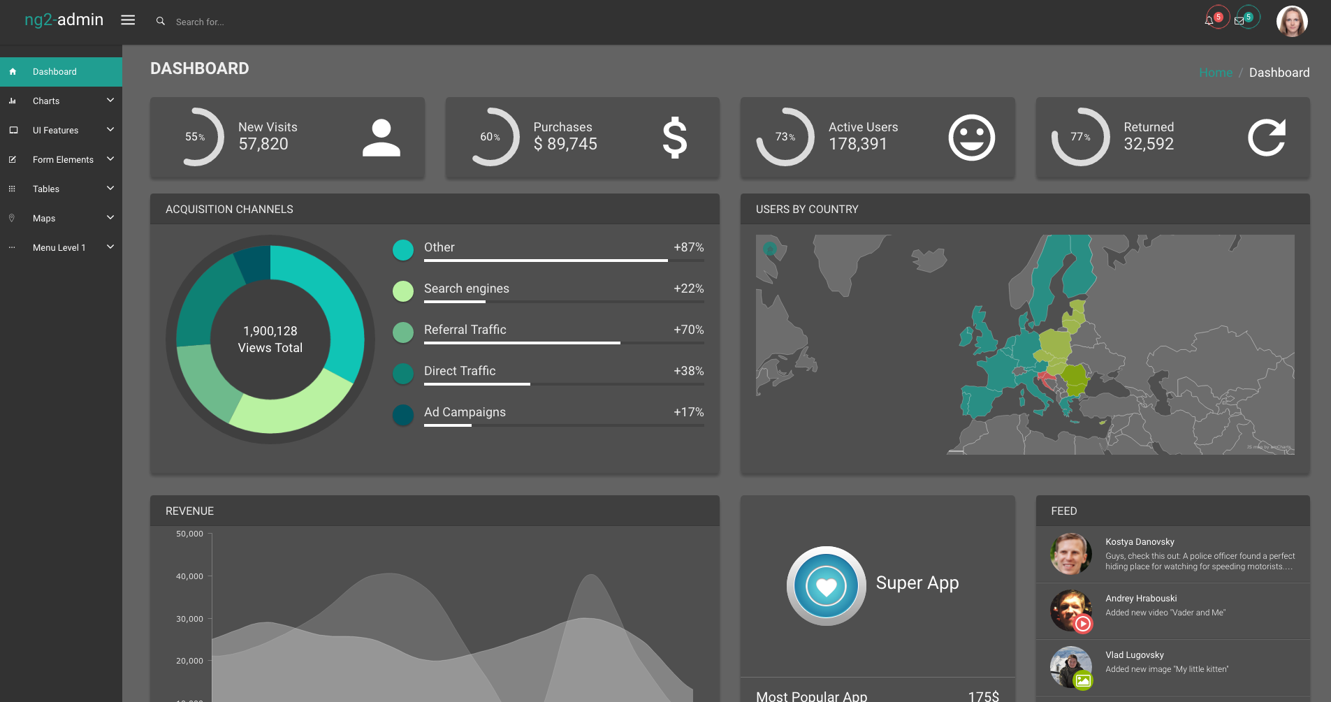
That’s basically it! Right now your admin application should look like this:

For further reference, please look in
- Colorscheme scss file (
src/app/theme/sass/conf/colorScheme/_ng2.scss,src/app/theme/sass/conf/colorScheme/_mint.scssandsrc/app/theme/sass/conf/colorScheme/_blur.scss) src/app/theme/theme.configProvider.jsto understand which javascript colors can be changed- If you want to know how to change the theme to blur, read the following article